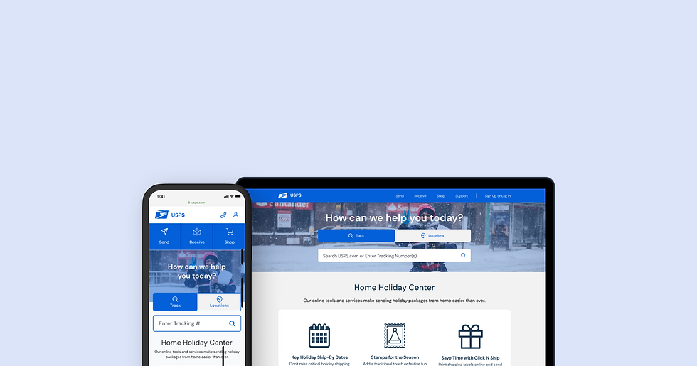
USPS Redesign
User Experience, Interface Design • 2020
OVERVIEW
This project was completed as part of a UI/UX Bootcamp. We were prompted to find a government website that could benefit from a website redesign and information architecture redesign.
The U.S. Postal Service website provides users with information about their shipping and mailing services. The focus for this project was to redesign the navigation of the website to be as simple and intuitive as possible for users.
MY ROLE
User Research, Wireframing, UI Design, Prototyping & Testing
DURATION
5 weeks / 2020
TOOLS
Figma, Miro, Trello, Photoshop
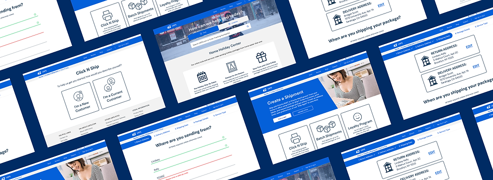
Defining the project scope
The U.S. Postal Service offers a wide variety of services to their customers, making their website navigation a particularly exciting challenge to tackle. I saw this redesign as a unique opportunity to bring a creative solution to a platform that offers such essential services to our communities.
The high-level goals were to:
• Understand the pain points for users navigating the current USPS website.
• Create a new information architecture system.
• Design, prototype and test a new USPS website solution for both desktop and mobile.


PROTO-PERSONA CARD
Tracking website workflows
Three primary USPS workflows were selected for analysis based on the needs of the proto-persona.
1. Creating Shipping Labels
2. Scheduling a Package Pickup
3. Purchasing Supplies
Analyzing the existing website workflows made it possible to narrow down the scope of work.

WORKFLOW 1: CREATING SHIPPING LABELS

WORKFLOW 2: SCHEDULING A PACKAGE PICKUP

WORKFLOW 3: PURCHASING SUPPLIES
User Testing
A thorough interview plan was written out to better understand the pain points that users experience when navigating through the USPS site. I wanted to learn more about how interviewees' would go about the following tasks:
1. Creating bulk shipping labels
2. Scheduling package pickups
3. Purchasing packaging supplies
5 guerrilla usability tests were conducted with our target audience to identify areas of confusion, issues or user questions.
.jpg)
FEATURE PRIORITIZATION MATRIX
Feature conceptualization deep-dive
With the findings from our user tests, I created a feature prioritization matrix to map out the features that would be most important for me to focus on in my redesign.
With the findings from our user tests, I created a feature prioritization matrix to map out the features that would be most important for me to focus on in my redesign.
It was important to consider what both the company and the user were in need of.
Conducting a heuristic analysis
An important part of the UI analysis process was to test the sites design and validate that it is truly usable and accessible for all users. This also helped to ensure that the designs are easy and pleasurable to use.
After conducting a heuristic analysis for the USPS home page, I annotated my findings to help communicate how and why some of their solutions are not usable.

HEURISTIC ANALSIS
Information architecture analysis
A top priorities for both USPS and its user is to have clear and intuitive information architecture. To better understand how users expect certain shipping and mailing services to be categorized, I recruited 2 participants for a virtual closed card sorting test.
Card sorting participants were given a predetermined set of category names and were asked to arrange the cards below into categories.

New Navigation Structure
All Primary & Secondary USPS Navigation Pages
TEST 1 RESUTLS

TEST 2 RESULTS

The results of the card sorting tests were used to create a new website structure that would allow users to locate the services they need more efficiently and intuitively.
With the goal of simplifying navigation as much as possible, the new navigation structure was given fewer primary navigation pages by nesting more pages.

NEW WEBSITE NAVIGATION STRUCTURE

Familiar terminology and additional visual context would be essential to help users understand where they are, what they've found, and what to expect while visiting the.
Sitemap
A sitemap was made to help organize and guide the website structure before creating the first round of prototypes.

USPS REDESIGN SITEMAP
Prototyping & testing
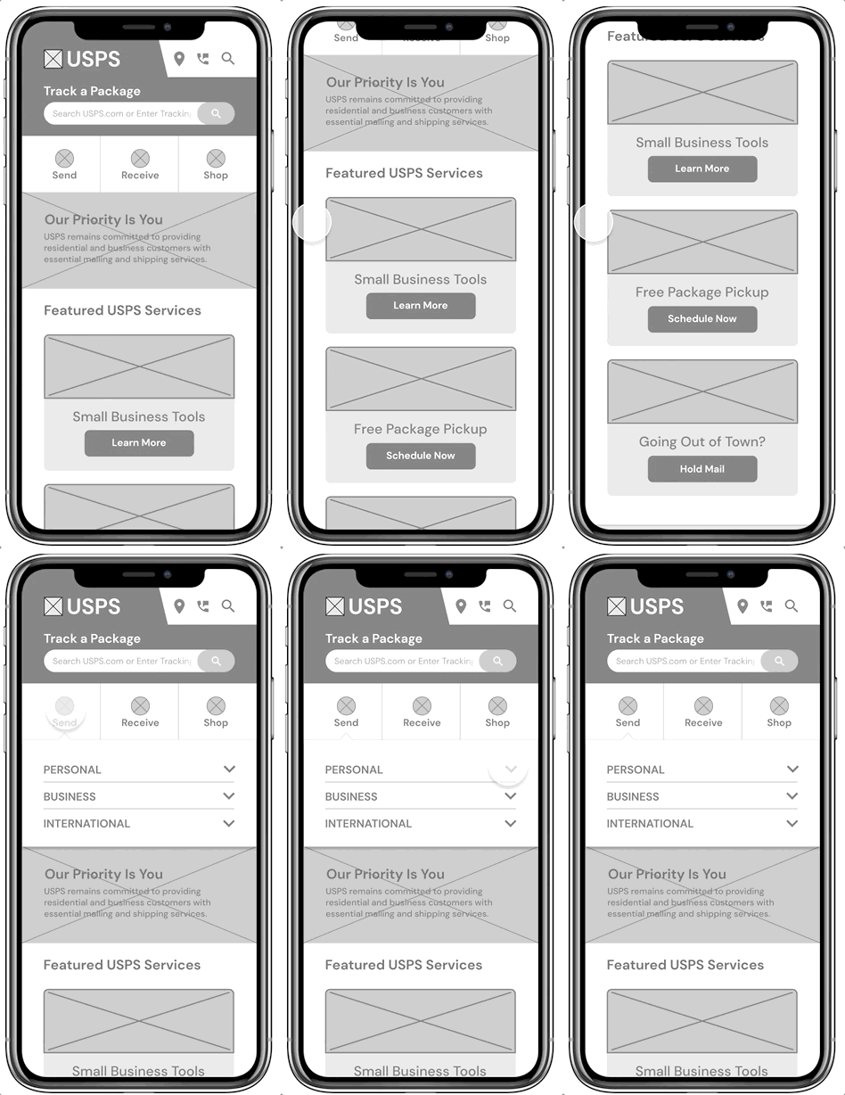
I began the design process by starting off with low fidelity wireframes. These wireframes were the framework for the desktop and mobile site and were used during testing.
The first iteration of wireframes focused on the following:
• Leading with the most important information first and aiming for each section to be interactive
• Allowing the user to access essential services without necessarily needing to view every part of the navigation
• Building out a major user flow for new and returning customers: creating and purchasing a shipping label
Desktop Wireframes

HOME PAGE

SHIP A PACKAGE PAGE

SHIP A PACKAGE FORM

SHOPPING CART
Mobile Home Page Wireframe
Usability testing takeaways
In order to validate these solutions, I conducted 3 remote guerrilla usability tests, asking participants to share their screens and think aloud while being recorded going through the prototype. I asked users to go through three tasks:
1. Create a shipping label
2. Purchase a shipping label
3. Find a USPS store nearest to them
100% of the usability testing participants were successful in completing the three tasks. However, it was clear that there was still some frustration. Users were still facing issues with the following:
1. Being able to quickly and easily locate a particular service
2. Feeling confident that they had successfully accomplished any given task
Wireframe iterations
Locating the shipping feature causes hesitation
1
The store locations button is too small and hidden
2
Gave the shipping feature and store locations button larger, more centralized spots


HOME PAGE
3
Uncertainty about what was and wasn't clickable
Added more visual queues, deliberate button shapes, and terms that users would be more familiar with


CREATE A SHIPMENT PAGE
Branding & UI design
I decided to incorporate a friendly, confident and approachable visual design into the site. It was important for users to have a welcoming and stress-free experience while still feeling like they've chosen a trustworthy and dependable service.
I also incorporated lots of icons and photos into the design to give users context and comfortability while visiting the site.

USPS STYLE TILE
High fidelity prototypes
Home Page
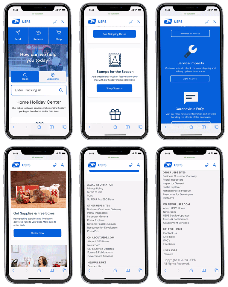
Upon entering, users are greeted with the most popular and commonly used USPS services above the fold.
The main challenge was figuring out how to organize the navigation so that users are provided with the essential features without overwhelming them. My solution was to turn the navigation into a drop-down so that users can easily digest all the information being displayed.
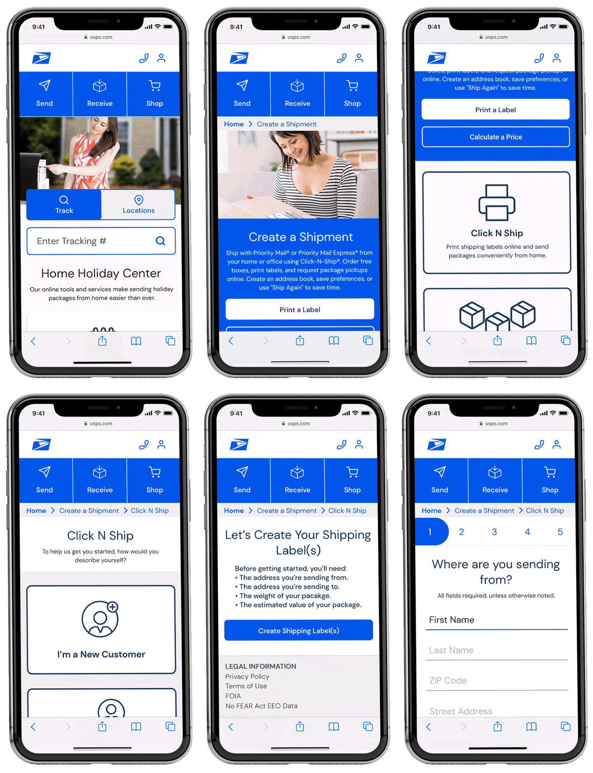
Creating a Shipping Label
Users can create shipping labels within the “Send” button found in the primary navigation. They are then taken to a popular USPS feature called Click N Ship to begin the process.
The process guides users each step of the way to provide peace of mind that they are indeed taking the necessary steps to create a shipping label.
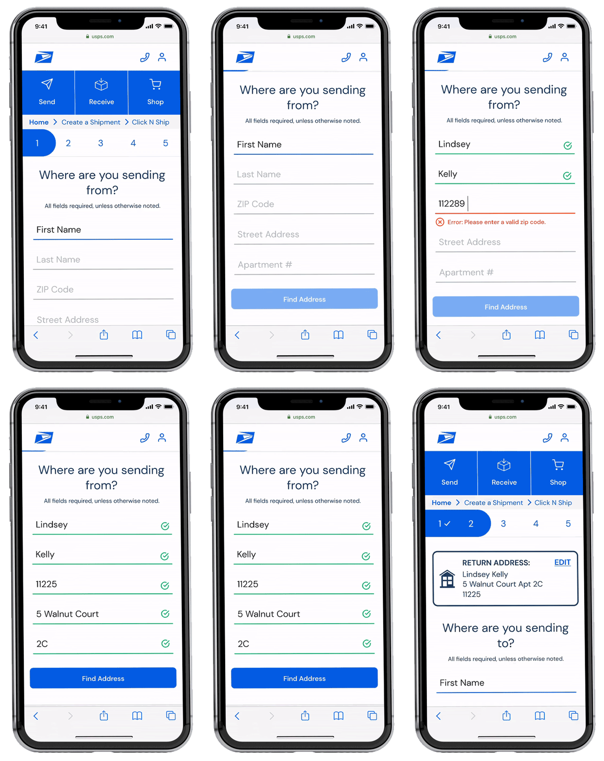
Text Fields & Forms
The user then launches into a simple step by step form that gathers the information needed to create a label. They can keep track of where they are in the process by following a status bar at the top of the screen. If the user inputs an error, they will be informed immediately to avoid frustration later on.
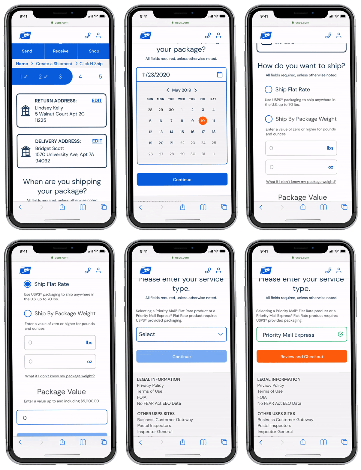
Questionnairre
The last portion of the form consists of answering package detail questions. These consist of a calendar date selection, multiple choice questions, and a dropdown menu. Once these have all been answered, the user can review their information and checkout.
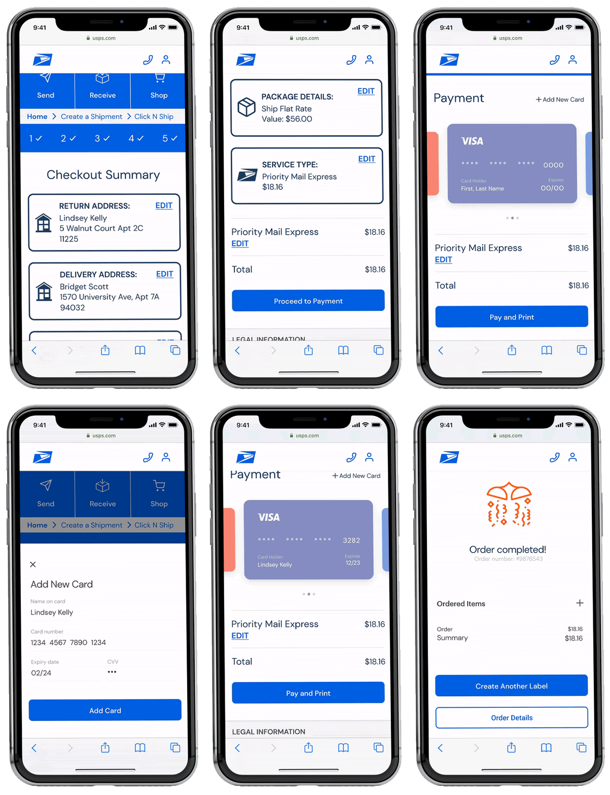
Purchase Shipping Label
Once the user reviews and confirms their shipping label details, they proceed to the payment process. The user is greeted with a cheery confirmation screen once they submit their payment, making it clear that they have completed the process.
Responsive screens
With USPS being such a widely visited site, it was imperative to design a seamless desktop experience in addition to mobile.
Desktop Home Page


Lessons learned and next steps
This website redesign project was the perfect opportunity for me to utilize my Information Architecture skills and design a fresh look for such a well oiled machine like USPS. When I first started the project, I was under the assumption that there would be very little improvements to make for such a large company. However, I quickly realized this was not the case.
Through research and prototyping, I discovered that there was lots of room for redesign that would make users lives easier while still achieving the goals of the company.
Moving forward, I would like to continue testing my prototype and reiterating on the wireframes to make it as great of an experience as possible for users.
