
Vicarious Surgical Rebrand
Brand Strategy, Web Design • 2022

OVERVIEW
Vicarious Surgical is a next-generation medical robotics company designing technology for minimally invasive surgery. As the first visual design hire, I spearheaded a rebrand to hit refresh in 2022. The aim was twofold: 1. To develop a visual identity that would position the brand as a safer, purpose-built, less-invasive approach to surgical robotic procedures and 2. To unify its look and feel across external facing platforms.
I collaborated with our Boston based PR agency, Matter Communications, to design and roll out the Vicarious Surgical rebrand and website refresh.
MY ROLE
Design Lead
THE TEAM
Solo designer with guidance from PR agency, 1 Copywriter, 2 Engineers.
TIMELINE
August 2021 - January 2022
The challenges of the existing website
The existing website for Vicarious Surgical, as observed at the time, housed little information about the technology being created and was presented in a disorganized manner.
Medical technology innovations should be shown in an awe-inspiring and informative manner. This sentiment was getting lost in the way content was arranged in the existing website.
While the content captured was quick to consume, it was difficult to locate any valuable information.

OLD VICARIOUS SURGICAL WEBSITE
Deep-diving and identifying pain-points in the current website
The first stage of the project was to better understand the existing website and how it was being received by the audiences that visit it. As a pre-commercial company, audiences of investors, surgeons, hospital administrators, and prospective employees are always looking to learn more about the state of the company and it's latest technology developments.
12 user testing sessions were conducted to determine the perception of the existing Vicarious Surgical website.

STAKEHOLDER & USER TESTING SESSIONS
Documenting user testing insights and key takeaways.
These testing sessions asked users to perform a wide range of tasks and workflows that someone who's discovering Vicarious Surgical for the first time is likely to go through. The highs and lows of the experience were recorded in the form of a Google Spreadsheet.

ANALYSIS OF VICARIOUS SURGICAL WEBSITE
Scoping down to a primary area of focus
The key learnings from stakeholder discussions revealed that there was an opportunity to accomplish the following goals:
-
Differentiate Vicarious Surgical technology from other medical device technologies.
-
Increase market awareness of the Vicarious Surgical robot.
-
Increase prospective employee applications.
Stakeholder discussions revealed that Vicarious Surgical lacked unique positioning amongst competing surgical robotics companies.
Wireframing
Wireframes were created to chalk out the website redesign layout based on the user testing learnings. I sourced information from several internal teams to pull forward the necessary information that was missing from the original website.
The intent was to:
1. Tell the Vicarious Surgical story through fresh technology-focused assets
2. Provide concise information in quick, easily digestible bites
3. Let visual assets provide rich information

VICARIOUS SURGICAL WEBSITE RE-DESIGN WIREFRAMES
Visual & brand language
A key update for this website refresh was the redesign of the Vicarious Surgical look and feel—from a single font with a plain gray color palette to something both fresh and evocative. The aim was to settle on an identity that would stand out amongst our competitors and to the medical robotics community.
In order to accomplish the website redesign goals, stronger brand assets were a must.

Crafting a look & feel that is patient-centric and awe-inspiring
The visual language combines patient safety with enticing, engaging photographic imagery and video footage featuring the technology in action to inspire and excite.
The imagery combined with the color palette, iconography and typography scales across not just the website, but communication media and marketing as well.


VICARIOUS SURGICAL WEBSITE RE-DESIGN STILLS
Key workflows
Examples of the website redesign workflows in action.

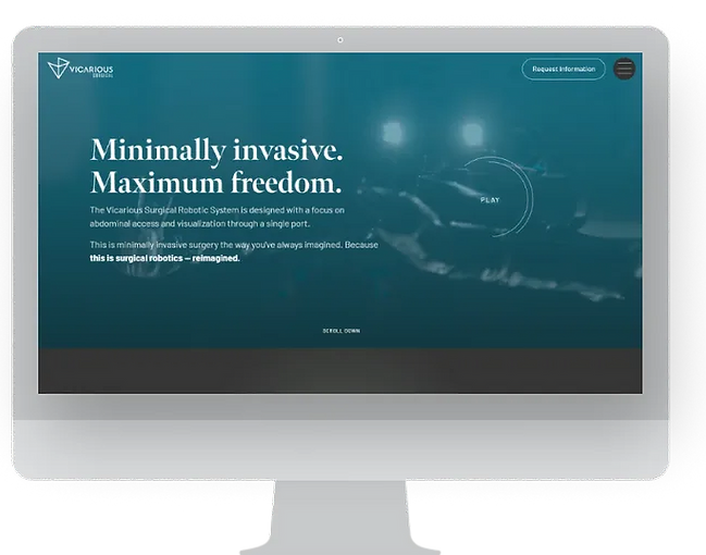
HOMEPAGE
The homepage walks users through the entire Vicarious Surgical story via technology-focused imagery and videos.
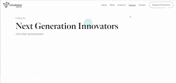
CAREERS
The careers page presents the awe-inspiring, innovative nature of Vicarious Surgical's robotic technology to excite prospective employees.
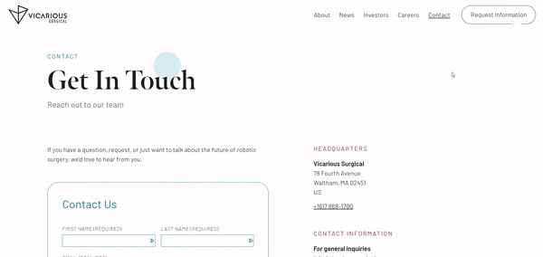
CONTACT US
The Contact Us page uses a simple fill-out form to make it easy for users to send their inquiries to our team.
Learnings & Reflections
BRAND ASSETS ARE ESSENTIAL
For this website redesign project, I learned the value of brand assets such as images, videos, renderings, and illustrations and how much impact they can have on the narrative presented in a website.
COPYWRITING IS AN ART FORM
Lots of discussion and workshopping amongst internal teams went into finalizing the copy for this website redesign. Creating concise and memorable copy that aligned with our brand tone was a challenge! This project allowed me to hone this skill.
CONTRAST AND READABILITY
Readability of text and typography needed careful consideration when combined with images. It's imperative to make sure text is always legible and accessible.
BALANCING SIMPLIFICATION
Since the original site had little information, the redesign required the sourcing of a ton of information to ensure the technology was being properly represented. However, it was important to ensure the information was still being shown in easily digestible, bite size chunks for users.